I took a typical learning design approach: identifying needs and feasibility aspects; design workshop to determine content and potential structure/flow; storyboarding; beta and alpha testing; feedback meetings; final product and refinement.
After some COVID-19 pandemic setbacks, it was published at the end of July in the university Virtual Learning Environment. I'm really pleased with the outcome and so are the Subject Matter Experts (SMEs). However, you can never be completely satisfied as there is always something you'd like to change or make better. But overall I am proud to have got this from conception then specification to implementation, as well as effectively conducting stakeholder management in handling SMEs content queries and expectations during production. Plus, my relationship with our learning design graduate has been strengthened by working together more closely on our eLearning courses and mentoring further in the process.
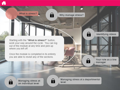
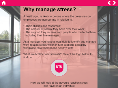
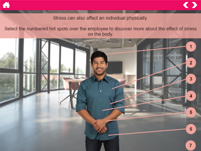
Below are some of the pages and interactive elements I made.
The button links to the layer below.
Each numbered circle links to a layer in the style like below.
Each numbered circle appears with hover over text boxes with bite-size information in. A green tick appears in the circle when visited.
The scroll bar on the pad allows you to view more text.An illustrated risk assessment that provides example sections in the highlighted layers, as per the one below.
Each numbered hexagon links to a layer in the style like below. A green tick appears in the hexagon when visited. This is also the colour scheme that appears on the main menu and throughout.
Each icon in the graphic links to a layer in the style like below.


